Utility management asks you to prepare a big analysis. You crunch the numbers and present your findings.
The action to take is obvious!
But they don’t act. They do nothing. What happened?
It’s probably your charts.
With a little guidance, you can do better!
We help you tell data stories that inspire action through clear and compelling charts and graphs.
Step 1:
Find your key message from the data.

Step 2:
Choose the right chart type.
Step 3:
Design a compelling chart free of clutter.
Step 4:
Write a strong title that clearly states the point of the chart.
You will benefit from good data visualization:
Your utility will make better policy decisions.
You will feel like all the time and energy that went into the analysis was worth it.
You will earn the trust and appreciation of your managers for your ability to turn data into action.
We offer tailored training on data visualization for your utility staff, or let us transform your charts for you.
Read more on our data storytelling services here.
Want help turning your analysis into action?
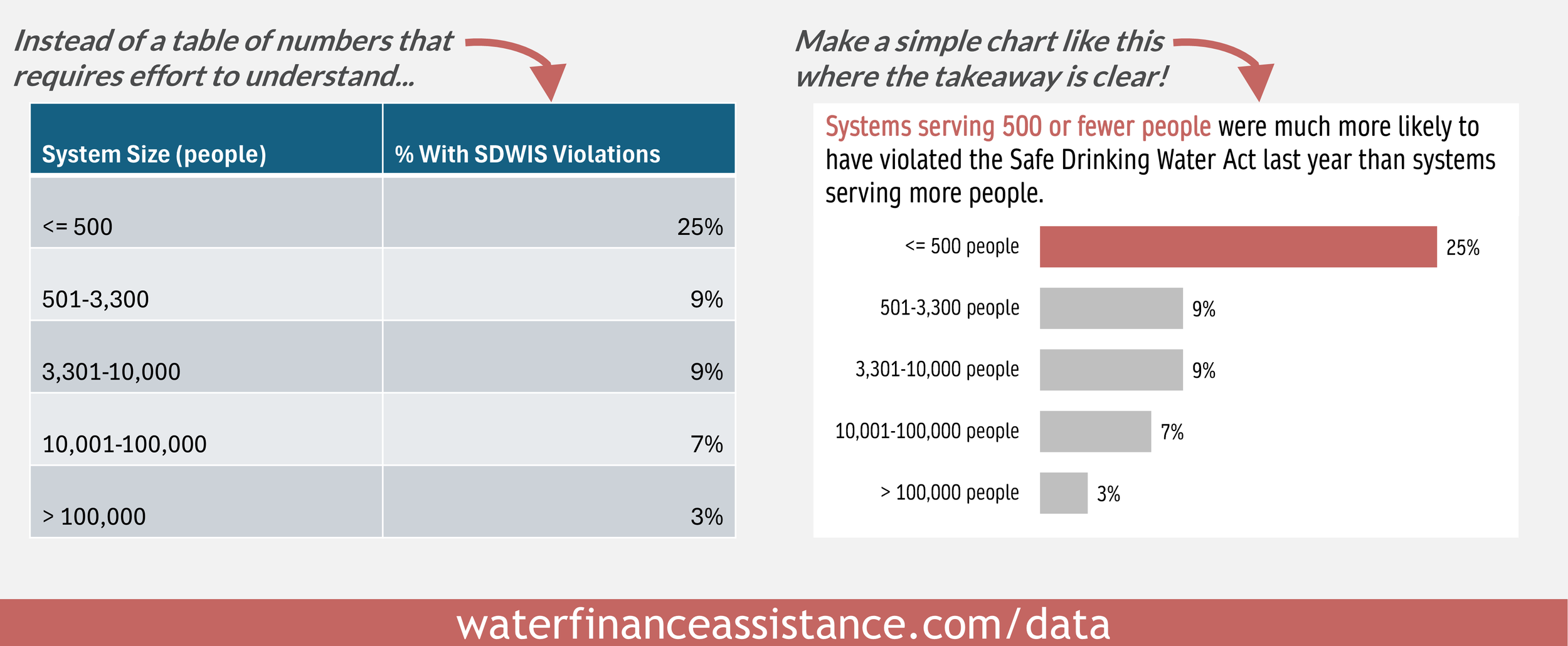
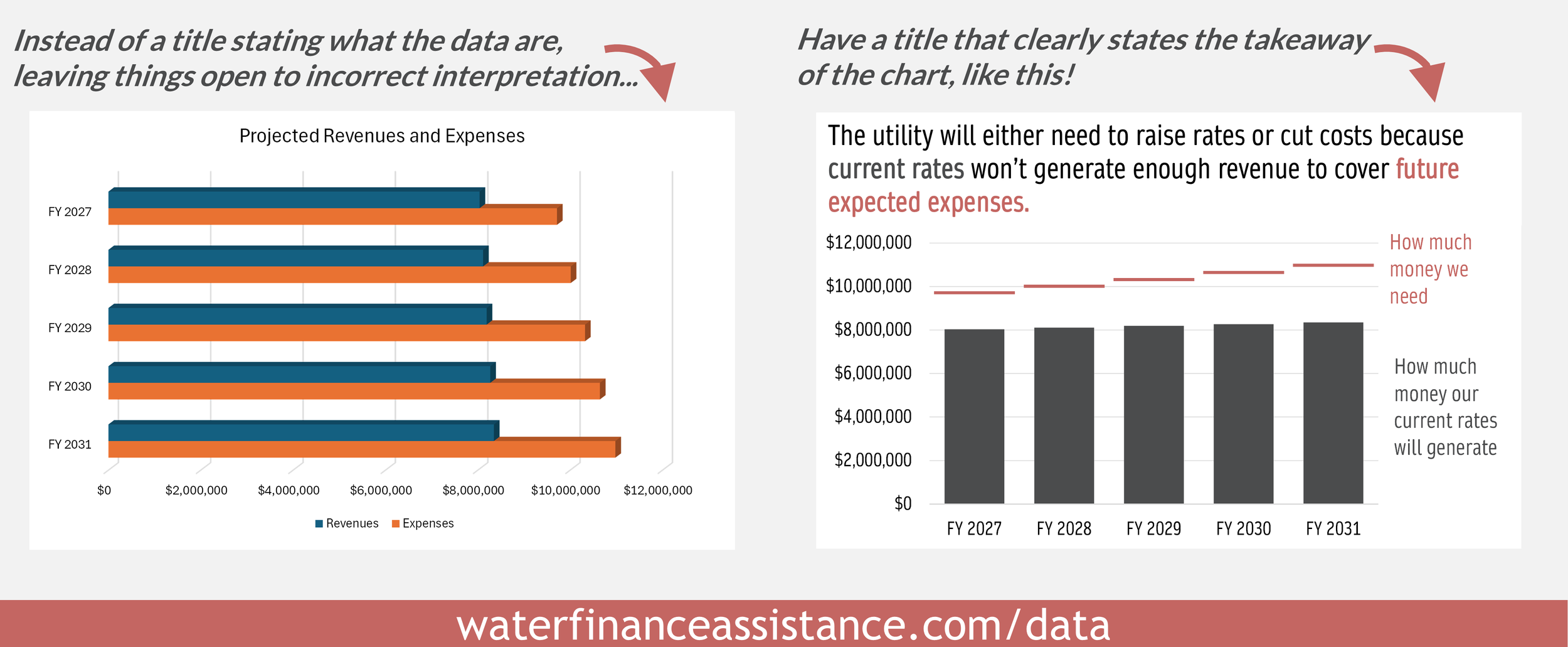
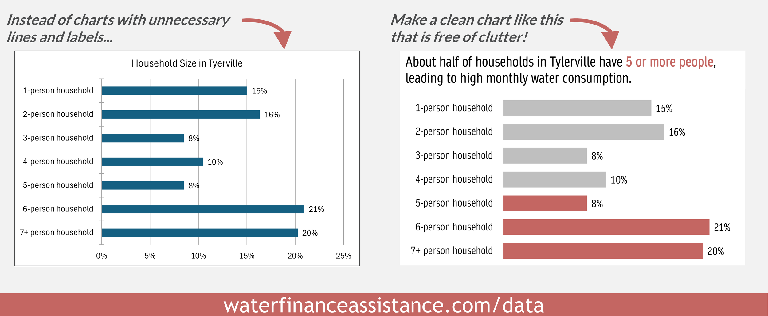
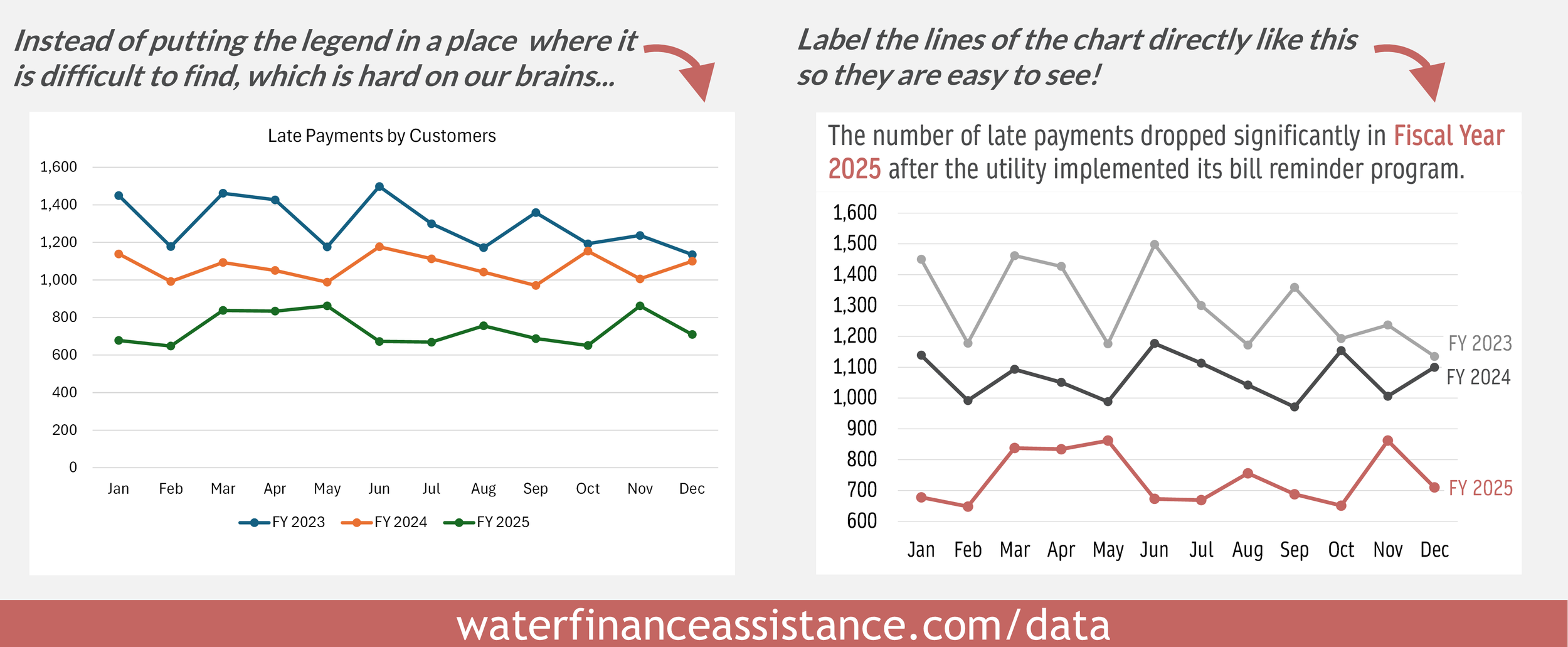
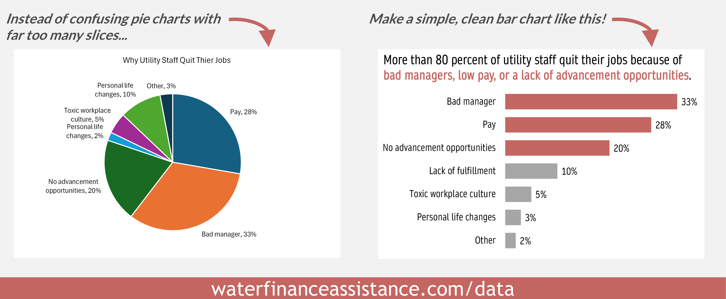
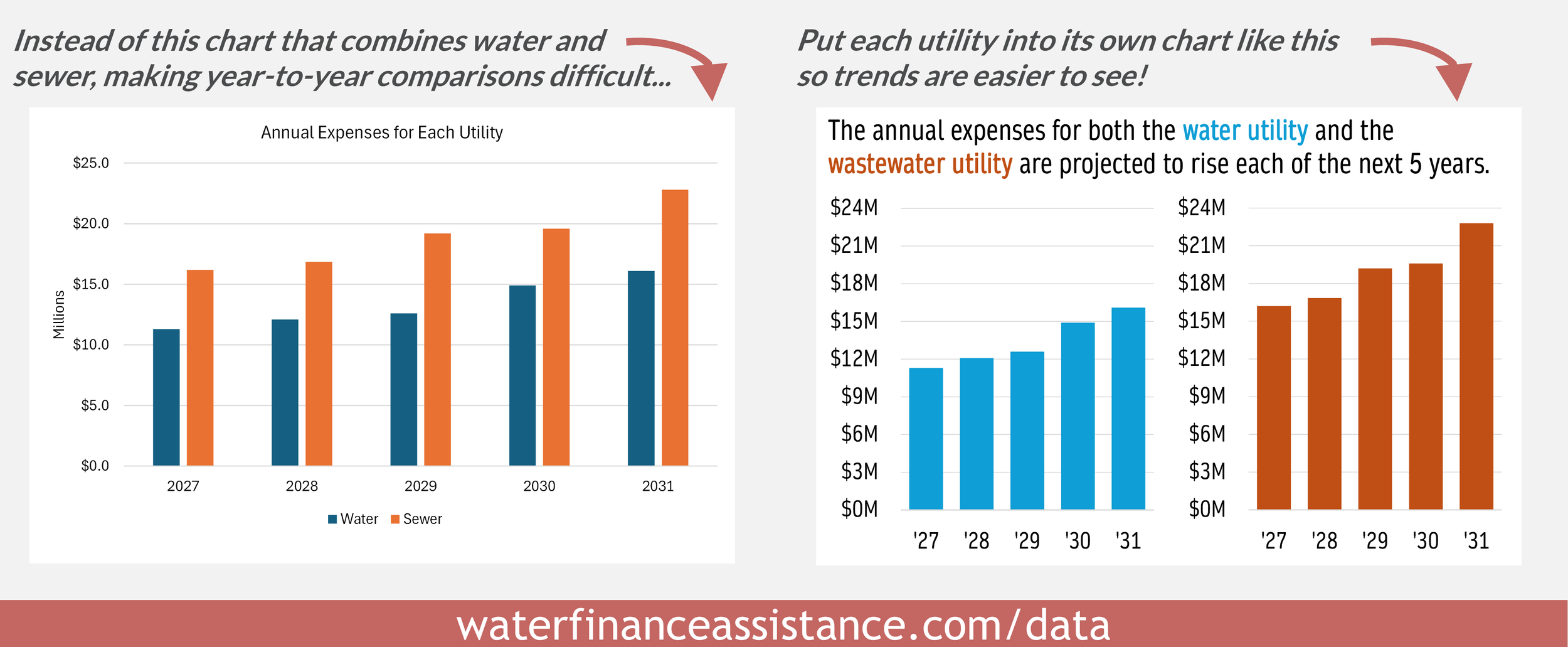
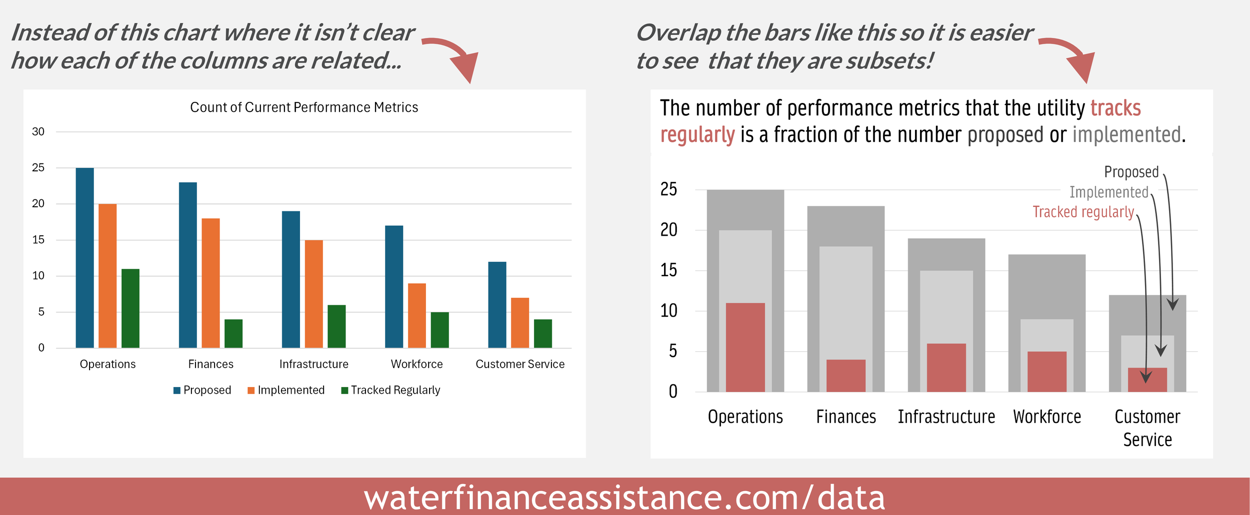
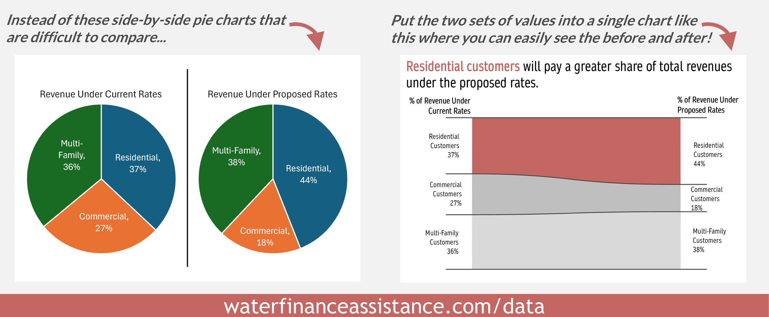
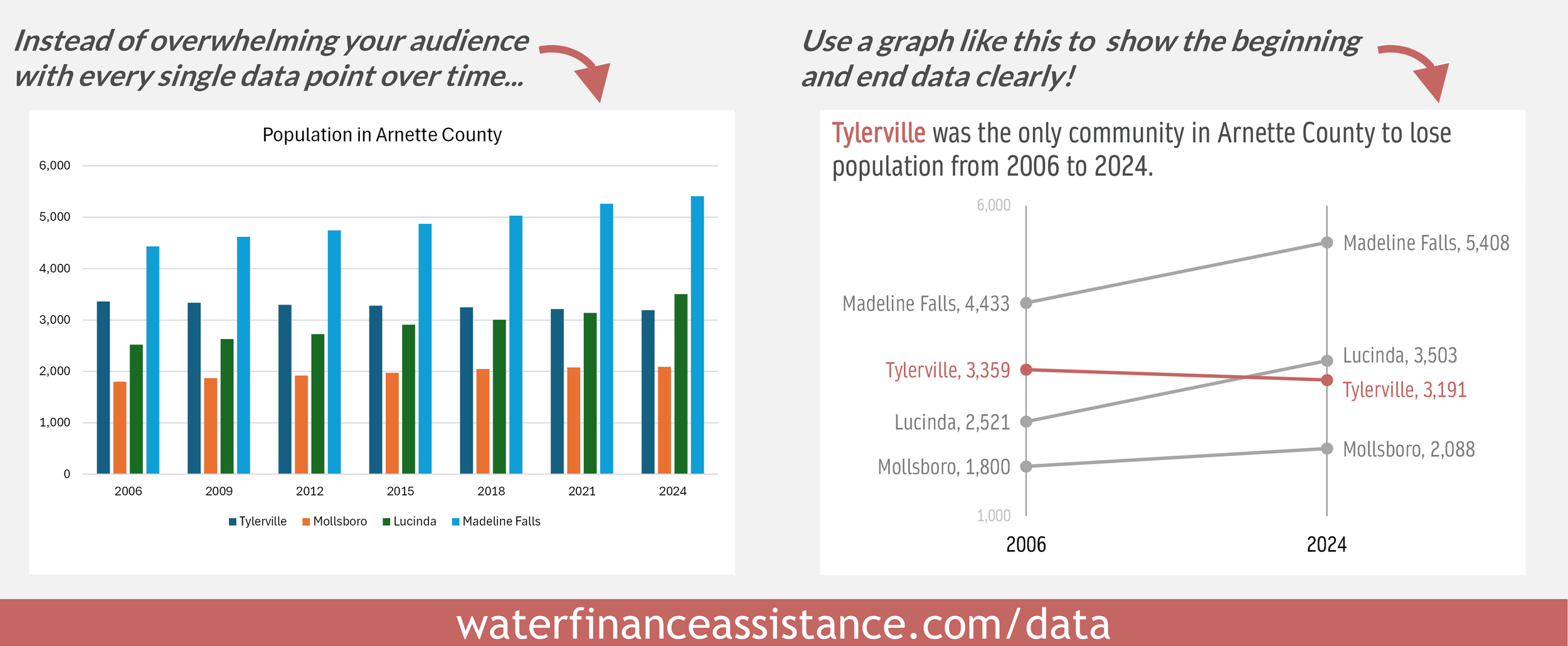
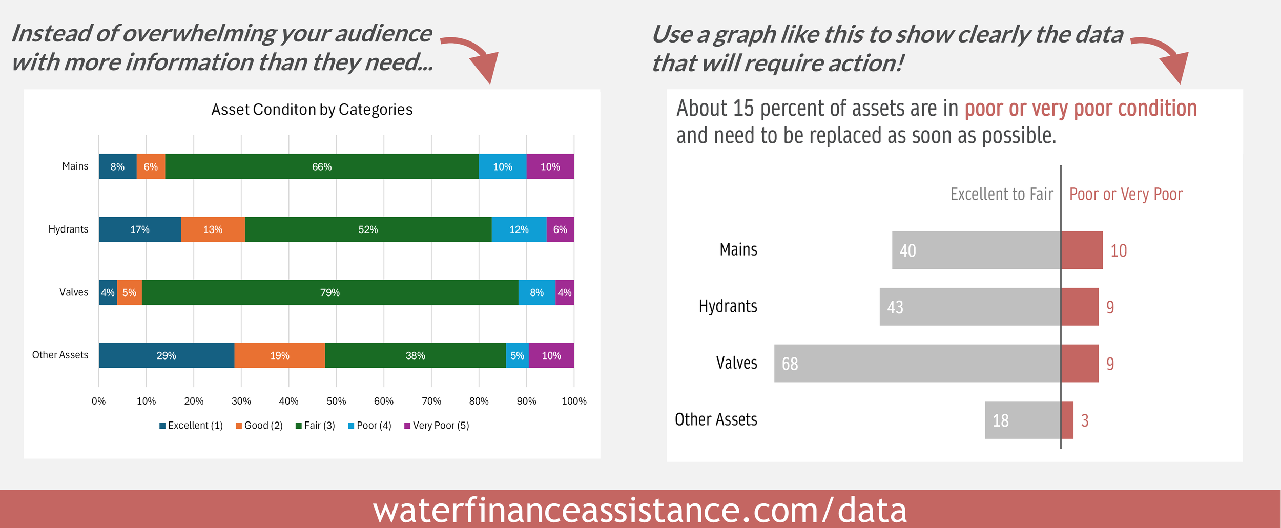
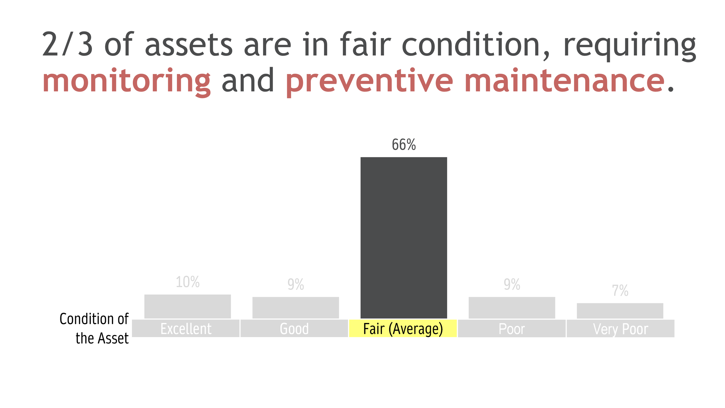
Scroll through the before-and-after images below to see simple strategies to improve how you show and discuss your data findings: